skip to main |
skip to sidebar
 Frazetta has a finely tuned sense of contrast, better than most painters, and it's easy to see why. It came from years of working in black and white doing comics. But going from pen and ink to oil paint has differences. With ink you're starting with white paper and adding the darks, and usually working from the foreground to the background. With oil and acrylic paint, you usually do the opposite, starting with the background and working to the foreground. For something like a black horse, ex. The Moonmaid above, you might start with a dark base and then add the lighter shades and highlights to define the muscles.
 The Outlaw of Torn at right is an awesome display of how Frazetta can create a design where everything seems in motion and all elements are at odd angles, but balance out with each other wonderfully. Notice how the horse leans to your left and the angles and lines of its legs and neck and the knight's shield are all tilted one way. And then tilted the other way are the horse's foreleg, the sword and the clouds to counterbalance. He also has made great use of a fiery red cape in more than a few paintings to help with the composition and contrast and it directs your attention to the character.
 When it comes to needing valiant warriors on beefy horses, or sexy sorceresses accompanied by ferocious animals, Fra
 zetta's your man. There are gorgeous snarling tigers and lions, black panthers, wolves, bears, gorillas, snakes, dinosaurs and monsters of all kinds. Anything with big teeth is a candidate for a Frazetta pet... or nightmare.
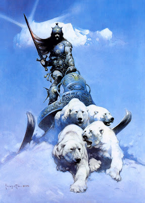
One of his most beautiful designs is The Silver Warrior. This big dude is coming over the crest of a snow peak riding in a crazy, stylized ski-chariot which is being pulled by a team of polar bears. How cool is that? This may be another example of Frazetta creating an image for a story which turns out to be more intriguing than the story it was created for. Such paintings have actually inspired rewrites and new stories centered around the characters Frank imagined.
zetta's your man. There are gorgeous snarling tigers and lions, black panthers, wolves, bears, gorillas, snakes, dinosaurs and monsters of all kinds. Anything with big teeth is a candidate for a Frazetta pet... or nightmare.
One of his most beautiful designs is The Silver Warrior. This big dude is coming over the crest of a snow peak riding in a crazy, stylized ski-chariot which is being pulled by a team of polar bears. How cool is that? This may be another example of Frazetta creating an image for a story which turns out to be more intriguing than the story it was created for. Such paintings have actually inspired rewrites and new stories centered around the characters Frank imagined.
The warrior is central to Frazetta's world and the swords they carry have two edges. A warrior may be a hero who protects maidens from harm, or he may be a viscious villain who will slice you to bits for breathing his air.
 That leads us to one of Frazetta's most evil, badass warriors of all time, The Death Dealer, who became famous after appearing on Molly Hatchet album covers in the 70's and in countless magazines and posters afterward. The Death Dealer is a seriously nasty-looking character who has ridden out of the burning, smoke-filled landscape, or what's left of it, and has stopped momentarily to gaze at you with glowing red eyes. He has noticed that you are still breathing... and he can't have that. His panting horse is actually snorting smoke. The horned helmet and that hooked axe, which would surely make a clean cut through your neck, are enough to make you unknowingly relieve yourself before bolting in the opposite direction.
 The way in which Frazetta painted the detailed metalwork on this medieval grim reaper is absolutely exquisite. A dent in the shield is perfectly placed.
But then when you look at the paint strokes on the hind side and legs of the horse, they are terrifically loose and seem as though they were hurled onto the horse with the skill of a marksman. It's amazing how much intensity he can put into a faceless figure just sitting on a horse. Another stroke of brilliance is the edges of the Dealer himself. Hair and cape blend into the background paint and help to give him the sinister spookiness he deserves. The rocky foreground looks practically unfinished. This is a choice... knowing when NOT to add detail... knowing when enough is enough. Vultures are following him for a meal. Like the Outlaw of Torn and The Silver Warrior, this is another pure masterpiece and could be his most famous image... or should I say infamous? Later paintings of The Death Dealer have him actually swinging that bloody battle axe.
For more on Frazetta and posts featuring Conan the Barbarian, click on these links:
Frazetta Part 1
Frazetta Part 3
Frazetta Part 4
Frazetta Part 5
Frazetta Part 6
Click on the header at the top of the page (A Burning Designer) to see the most recent posts by Mark Astrella
The way in which Frazetta painted the detailed metalwork on this medieval grim reaper is absolutely exquisite. A dent in the shield is perfectly placed.
But then when you look at the paint strokes on the hind side and legs of the horse, they are terrifically loose and seem as though they were hurled onto the horse with the skill of a marksman. It's amazing how much intensity he can put into a faceless figure just sitting on a horse. Another stroke of brilliance is the edges of the Dealer himself. Hair and cape blend into the background paint and help to give him the sinister spookiness he deserves. The rocky foreground looks practically unfinished. This is a choice... knowing when NOT to add detail... knowing when enough is enough. Vultures are following him for a meal. Like the Outlaw of Torn and The Silver Warrior, this is another pure masterpiece and could be his most famous image... or should I say infamous? Later paintings of The Death Dealer have him actually swinging that bloody battle axe.
For more on Frazetta and posts featuring Conan the Barbarian, click on these links:
Frazetta Part 1
Frazetta Part 3
Frazetta Part 4
Frazetta Part 5
Frazetta Part 6
Click on the header at the top of the page (A Burning Designer) to see the most recent posts by Mark Astrella
 There is little doubt that Frank Frazetta is the king of fantasy adventure & science fiction art. I've always found Frazetta's art to be stunning and recently, I became the proud owner of a signed, original sketch by the master of fantasy art himself and I am VERY excited about it.
 But before I show it here, I'm going to write a few posts about him. In doing some research to try to date my sketch, I've discovered Frazetta all over again. If you're not familiar with his name, you've probably seen his work somewhere.
When it comes to talent and technique, Frank Frazetta is like Bruce Lee. He just kicks out the light bulb on the ceiling with an unexpected motion of
But before I show it here, I'm going to write a few posts about him. In doing some research to try to date my sketch, I've discovered Frazetta all over again. If you're not familiar with his name, you've probably seen his work somewhere.
When it comes to talent and technique, Frank Frazetta is like Bruce Lee. He just kicks out the light bulb on the ceiling with an unexpected motion of  intensity and precision. His style is truly unique and his power makes your eyes widen. There's been a long line of Frazetta imitators, some of them very good painters... but their over-posed heroes turn out looking cheesy in comparison. We shouldn't be too harsh on them, however, because they've also been mesmerized by his amazing compositions.
Frazetta began his career doing comics, and in the 50's he began illustrating Edgar Rice Burrough's Tarzan books. His illustrations of the seriously-muscular Conan for Robert E. Howard's books were so eye-catching that sales went ballistic.
I first saw Frazetta's work in a 1978 calendar and was so taken that I bought one of his art books soon after featuring the Egyptian Queen on the cover. An intriguing composition that has this sensual beauty slinking up against a massive marble column. She makes you feel the cold stone on her skin. Originally published on the cover of Eerie magazine, there's a tenseness in the room with the crouching cat and the figure in the background.
intensity and precision. His style is truly unique and his power makes your eyes widen. There's been a long line of Frazetta imitators, some of them very good painters... but their over-posed heroes turn out looking cheesy in comparison. We shouldn't be too harsh on them, however, because they've also been mesmerized by his amazing compositions.
Frazetta began his career doing comics, and in the 50's he began illustrating Edgar Rice Burrough's Tarzan books. His illustrations of the seriously-muscular Conan for Robert E. Howard's books were so eye-catching that sales went ballistic.
I first saw Frazetta's work in a 1978 calendar and was so taken that I bought one of his art books soon after featuring the Egyptian Queen on the cover. An intriguing composition that has this sensual beauty slinking up against a massive marble column. She makes you feel the cold stone on her skin. Originally published on the cover of Eerie magazine, there's a tenseness in the room with the crouching cat and the figure in the background.
 To the right is a preliminary sketch for this painting. It's interesting to see how he developed it from this stage to the final painting. Even Frazetta's pencil sketches are like little jewels that reveal his enormous natural talent and they are now going for thousands of dollars. I can't remember ever buying the work of another artist and I would only hang my own art on my walls, but that all changed when I came across a little sketch of Conan that I just couldn't resist.
 One thing that fascinated me is the way he would leave detail out in certain areas... something I've always had difficulty doing. I'll nitpick over every toenail whereas Frank won't even include the lower legs. His choices of what to leave out are brilliant. The details just fall away into the shadows. They become obscured by smoke or fog or the dust kicked up by the battle. Creatures emerge from the canvas similar to the way the presidents on Rushmore emerge from the mountain.
Neanderthals rush toward you from an orange mist... and they have only one intent... to club the life out of you.
One thing that fascinated me is the way he would leave detail out in certain areas... something I've always had difficulty doing. I'll nitpick over every toenail whereas Frank won't even include the lower legs. His choices of what to leave out are brilliant. The details just fall away into the shadows. They become obscured by smoke or fog or the dust kicked up by the battle. Creatures emerge from the canvas similar to the way the presidents on Rushmore emerge from the mountain.
Neanderthals rush toward you from an orange mist... and they have only one intent... to club the life out of you.
Frazetta loves to toy around with our fears. Of course, years of creating covers for publications like Creepy, Eerie and Vampirella had him working from that state of mind.
 In Bran Mak Morn to the right, he again uses top light to accentuate the big brows on the primitive's apelike features. The long, dark shadow under the tribal leader's face creates powerful contrast
.
Top light like this is used often in theatrical lighting to create drama on the figure.
The  painting of the Captive Princess below skillfully plays with contrasts between cool and warm colors, light and shadow, soft and hard textures, and between what is in motion and what is poised in place. She reaches in desperation for something to grab onto that isn't there.
The musculature and veins are exaggerated but believable, and the color choices are unorthodox... geez, Frazetta would hurl big splotches of green and purple paint right on the skin, but you don't even notice it! It all just works in some dynamic way and seems to emphasize the action.
Just look at the patchwork of paint dabs he lays down on the back of Conan in his painting called Chained. Those muscles aren't real. Frazetta didn't ask a model to pose for him for this. That's just his mind imagining the muscular back of Conan. It works! Because of the passion he brings to the canvas.
 Read the rest of this series on Frank Frazetta by Mark Astrella.
Frazetta Part 2
Frazetta Part 3
Frazetta Part 4
Frazetta Part 5
Frazetta Part 6
To see the most recent blog posts, click on the logo header at the top of the page (A Burning Designer)
Read the rest of this series on Frank Frazetta by Mark Astrella.
Frazetta Part 2
Frazetta Part 3
Frazetta Part 4
Frazetta Part 5
Frazetta Part 6
To see the most recent blog posts, click on the logo header at the top of the page (A Burning Designer)
 I was asked to create these little characters for Rational Acoustics, a company that makes software for acoustical analysis. For now, they're using the 7 Bad System Dwarves on t-shirts. Each dwarf represents one of those nasty tones that need to be flushed out of a sound system.
The 7 Bad System Dwarves are called Tubby, Muddy, Boxy, Honky, Barky, Edgy, and Sibilant. Getting rid of them usually involves a sound man incessantly repeating some inane phrase into a microphone like "checking, one two". He'll repeat this about five hundred times followed by even more annoying tooth clicks and kissing noises until everybody within ear shot is ready to beat him senseless with his own microphone. But I digress!
Hopefully, Rational Acoustics technology will help make this annoyance no longer necessary. Click on the image to check out the details in the dwarfs.
 This old 1000 watt Times Square follow spot was given to me about a year ago and it had been gathering dust and rust in a corner. Last week I was asked to do some scary lighting for a Halloween party and got the idea that maybe I could somehow insert a gobo of a witch or a ghost into this follow spot and then have it fly around the room as I move the light around.
Unfortunately, on closer inspection, this light was an accident waiting to happen. The wires were frayed and the socket was arcing. It was too dangerous to even turn on. So this past week I took it completely apart, cleaned it, replaced the socket and power cable. Unable to find a lubricant that is non-flammable, I used powdered graphite to lube the shutter, iris and sliding focal lens. Then I repainted it using high-temperature Rustoleum spray paint. The hardware store carried 3 chioices of high-temp paint; black white and this copper color. The original color was a dark grayish-brown so I thought the copper would really jazz it up. After all, it's an antique (probably from the early 60's?).
I think the copper color really emphasizes the retro look. I love it!
 Yes, there IS water on the Moon.That means I'm going ahead with my latest entrepreneurial venture... to bring back the finest, purest water from the polar regions of the Moon, then bottle it and sell it to the entire planet!
Moon RiversTM bottled water will taste like no other water on this Earth... pure, crisp and completely free of pollutants and bacterial contaminants... and with just a slight hint of fine, aged cheese. It contains minerals rich in calcium, iron and magnesium... the original Moonshine!
The low gravitational environment of the moon's polar regions has given this premium water a unique characteristic that will make it go down very, very slowly, filling the craters of your soul.
Stored in a frozen state for over 4 BILLION years, Moon Rivers lunar polar water will soon be Shuttled to your local dealer who will deliver it to your home or business each lunar month for your healthy enjoyment.

We hope to get the endorsements of the likes of Buzz Aldrin or Neil Armstrong to appear in commercials accompanied by background music playing the Andy Williams favorite, "Moon River".
Sing along with Neil:
"Moon Rivers, wider than a mile,I'm drinking you in style some day."Now YOU can get moonstruck by this exciting enterprise and become a part of it.Caspian Sea Wells, LLC is currently seeking capital investors to help finance this new venture. Don't miss the opportunity to get in on the ground floor! Only a few have walked on the moon, be one of the first to wade into the ocean of opportunity in the southern pole basin where the tides of wealth await your investment. Shoot for the moon! Send your investment check to me personally and I'll send you a share ($100 dollars = 1 share).BUT WAIT! That's Not All... for only a limited time, I'll also send you a nifty Moon Sponge©!
BUT WAIT! I'll send you a second Moon Sponge Free! Act Now!
 Halloween is approaching and the ghosts are beginning to creep out from their dark corners.
Why is it they want to haunt the living, anyway?
Maybe they're in need of something... something they've lost and hope the living can return to them. Chances are they either seek atonement for wrongs they perpetrated in life, or restitution for wrongs committed against them.
I fear no ghosts. What they really are, are just old memories... regrets, missed opportunities... poor choices. They're shadows of inflicted pain, misery and fear... remorse for broken promises... remnants of a conscience that continues to struggle with past sins. They are human shame seeking forgiveness for betrayal.
And they pop up every now and then in the hope that the wounds they once inflicted have healed and those they've betrayed no longer hold them responsible. What they really need to do is to make amends within themselves.Shoo, ghost!
 What happens when a graphic designer gets served a bad meal? Do they summon the waitress over and complain about the dry, tasteless fish? NO! That'll cause embarrassment. It could also initiate something even worse. Something that nobody would know about except the scorned cook! Best to just take the crappy food away, pay the bill and never come back.
Hmmm... must think of a way to communicate displeasure with the food without actually having to whine to the server. A-HA! Redesign the presentation! The message will get passed on to the cook, but the angry reaction will be tempered by the creative re-use of this culinary catastrophe.
OK, now walk fast so the cook doesn't see you...
 Took this photo last year in Old Wailuku Town, Maui, on a quiet Sunday morning.
I spent many years painting signs when I was young and so I tend to notice hand-painted signs. I've also grown to appreciate that weathered look. This sign isn't a masterpiece by any measure, but I guess it was the setting that caught my eye. This section of Wailuku Town is just off the Main drag and has several pawn shops, cafes and antique shops. By the looks of the attached Coke sign, they both have probably been hanging there for over 50 years.
 I used to go to a nearby coffee shop every morning, order a muffin and coffee, read the paper and sketch out ideas. Then the wise town officials tried to revitalize the neighborhood by widening the sidewalks and adding benches and trees along the road. That resulted in fewer parking spaces. Now there's rarely a place to park and I've stopped going there. What a shame. I miss some of the funky charm it had when the sidewalks were crumbling. Some of the patina is gone forever. It's as if someone were to replace the Bungalow and Coke signs with modern lookalikes. Sooner or later they'll be taken down, so I'm appreciating 'em now, by freezing them in time through photographs.
Johnny H made a great comment on a previous blog post of mine about a reclining nude drawing where he suggested, "...make a version with her in curious situations – on the floor of a grocery store, on the back of an alligator. Or as a "miniature" on a pencil or something."
Knowing John personally, this guy is a creative genius. So I'm running with it.Now, I couldn't drum up a decent alligator photo, so I did the next best thing... I threw her into a walrus pod. I think she seems very relaxed and fits in nicely, don't you? But John suggested something else to me... that I could think of her as a 3-dimensional object... like a sculpture.
So maybe she could be made into a nudey guitar...? (easy on those high notes, there, Izzie...)

...or how 'bout some unique bathroom towel hooks...?

Well, I'll never look at her the same now...
Thanks, John. You've commercialized my nudey...
damn creative directors... Hmmmph!
 Mick Fleetwood's band baking in my lights
New images have been added to my website portfolio under the heading of "Stage Lighting". Over 50 photos from live performances display a variety of lighting techniques along with some explanations of how I created the looks.
I've lit just about every type of show... rock bands, symphonies, plays, musicals, ballet, worship... everything from whirling dervishes to Chinese circuses. At an average of about 3.5 shows per week for the last 3.5 decades, that's well over 6000 gigs. I reckon I have more show experience than most of the performers I light. But it's all about them, not me. The purpose is to express and enhance what is occurring on stage.
Unless the show is being taped, it's only for the moment. These are snapshots of some of those moments.
See them listed under "Stage Lighting" in the portfolio section.


 Frazetta has a finely tuned sense of contrast, better than most painters, and it's easy to see why. It came from years of working in black and white doing comics. But going from pen and ink to oil paint has differences. With ink you're starting with white paper and adding the darks, and usually working from the foreground to the background. With oil and acrylic paint, you usually do the opposite, starting with the background and working to the foreground. For something like a black horse, ex. The Moonmaid above, you might start with a dark base and then add the lighter shades and highlights to define the muscles.

 zetta's your man. There are gorgeous snarling tigers and lions, black panthers, wolves, bears, gorillas, snakes, dinosaurs and monsters of all kinds. Anything with big teeth is a candidate for a Frazetta pet... or nightmare.
 That leads us to one of Frazetta's most evil, badass warriors of all time, The Death Dealer, who became famous after appearing on Molly Hatchet album covers in the 70's and in countless magazines and posters afterward. The Death Dealer is a seriously nasty-looking character who has ridden out of the burning, smoke-filled landscape, or what's left of it, and has stopped momentarily to gaze at you with glowing red eyes. He has noticed that you are still breathing... and he can't have that. His panting horse is actually snorting smoke. The horned helmet and that hooked axe, which would surely make a clean cut through your neck, are enough to make you unknowingly relieve yourself before bolting in the opposite direction.
 The way in which Frazetta painted the detailed metalwork on this medieval grim reaper is absolutely exquisite. A dent in the shield is perfectly placed.